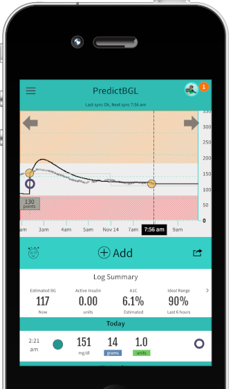
Integrate live data from Dexcom and NightScout to improve dosing decisions, and to instantly compare the expected dose result with the actual result.
The chart below shows a series of CGMS readings (black dots) overlaid on a set of finger stick blood sugar readings (green dots). Predictions are shown here as a yellow line, and it is easy to see where the blood sugar predictions deviate from the CGM measurements and where dosing changes need to be made. For example, the first orange coaching dot on the left at 4:25am indicates that the dose is not high enough, as the prediction is way lower than the actual blood sugar. Pressing the orange dot leads to coaching tips that indicates what dose changes could be made. Once this is done, predictions and actuals move closer together, and doses improve.
